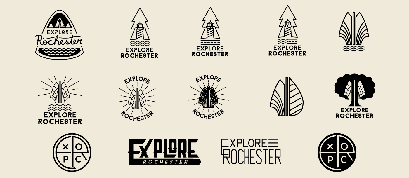
Preliminary logo process
As we worked to develop an identity for Explore Rochester, we considered many different avenues. Working with designer Joe Snell, we took inspiration from various landmarks around the city and its suburbs to draft a wide array of marks. Explore Rochester works to get people outside, so we wanted an icon that had a visual relationship to nature and the outdoors. Scalability was of the utmost importance because the logo would live primarily in a 100px x 100px circle on Instagram. With this in mind, we moved forward with the circular logos seen at the bottom.
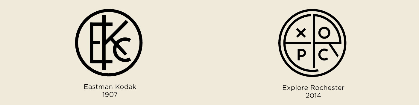
Original Eastman Kodak logo; 1907, Explore Rochester logo; 2014
In 1907, Eastman Kodak Company became the first company to integrate its name and look into a symbol. While developing our logo, I wanted to pay homage to the local icon that helped pave the way for adventure-seekers to document their explorations. I borrowed the circular shape and made sure all lines maintained an equal weight in order to pay my respects.

Logo Process
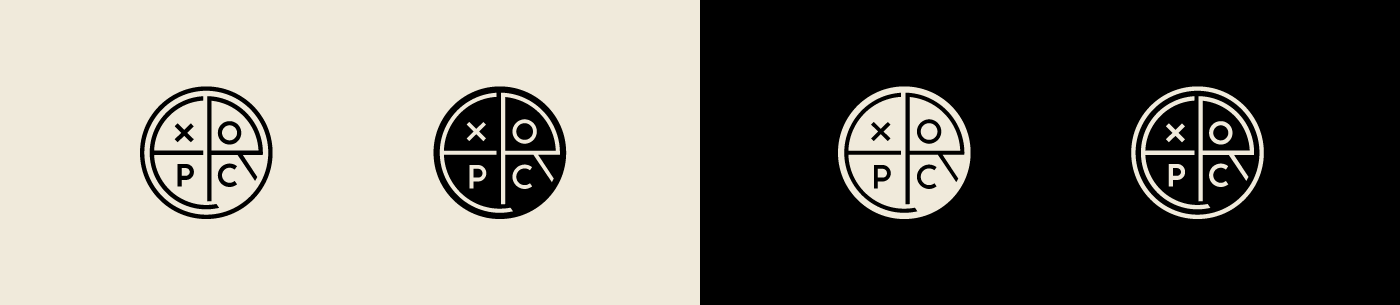
Final Logomarks
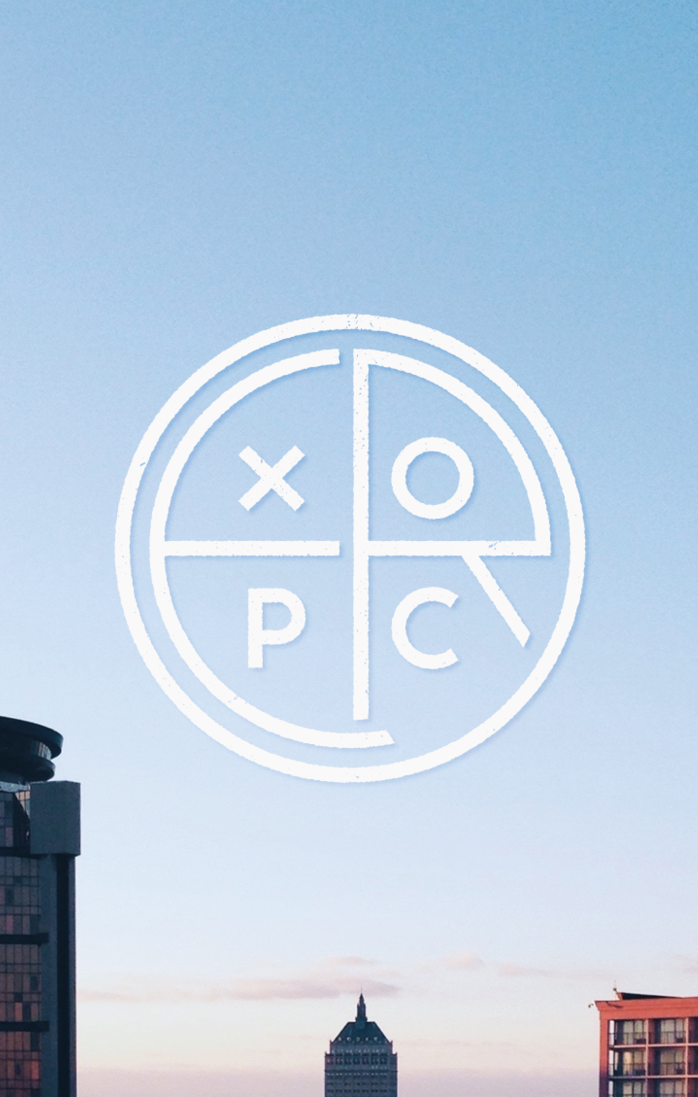
The final logo mark combined the first three letters of the two words (ExpRoc) to create a single circular icon. We have two primary icons that serve their purpose in specific settings. The filled logo mark rests primarily on our introductory and sponsor images; it carries a heavier weight to ensure it stands out on an image. The line-driven mark serves as our avatar on all social media.

Guidelines for introduction and partnership images
Every week a new contributor shares their perspective of Rochester. On Sunday evening, that contributor is introduced with a photo and a short bio. In order to maintain a consistent image, I developed a set of guidelines for logo size and placement. Given the location of the Instagram "heart" and other info being located on the bottom left-hand side of an Instagram post, I chose to place our icon there. The users eye is already looking at this mobile real-estate, so it was a natural decision. This strict placement ensures every introduction of partner or contributor carries the same format and stands out amongst the feed.
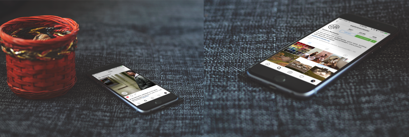
Logo on introduction image, Logo on page header
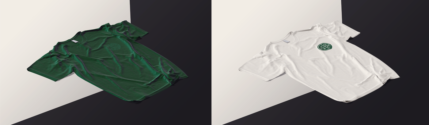
Tshirts designed for Year One gallery. Monochromatic and beige printed by Big City Sportswear
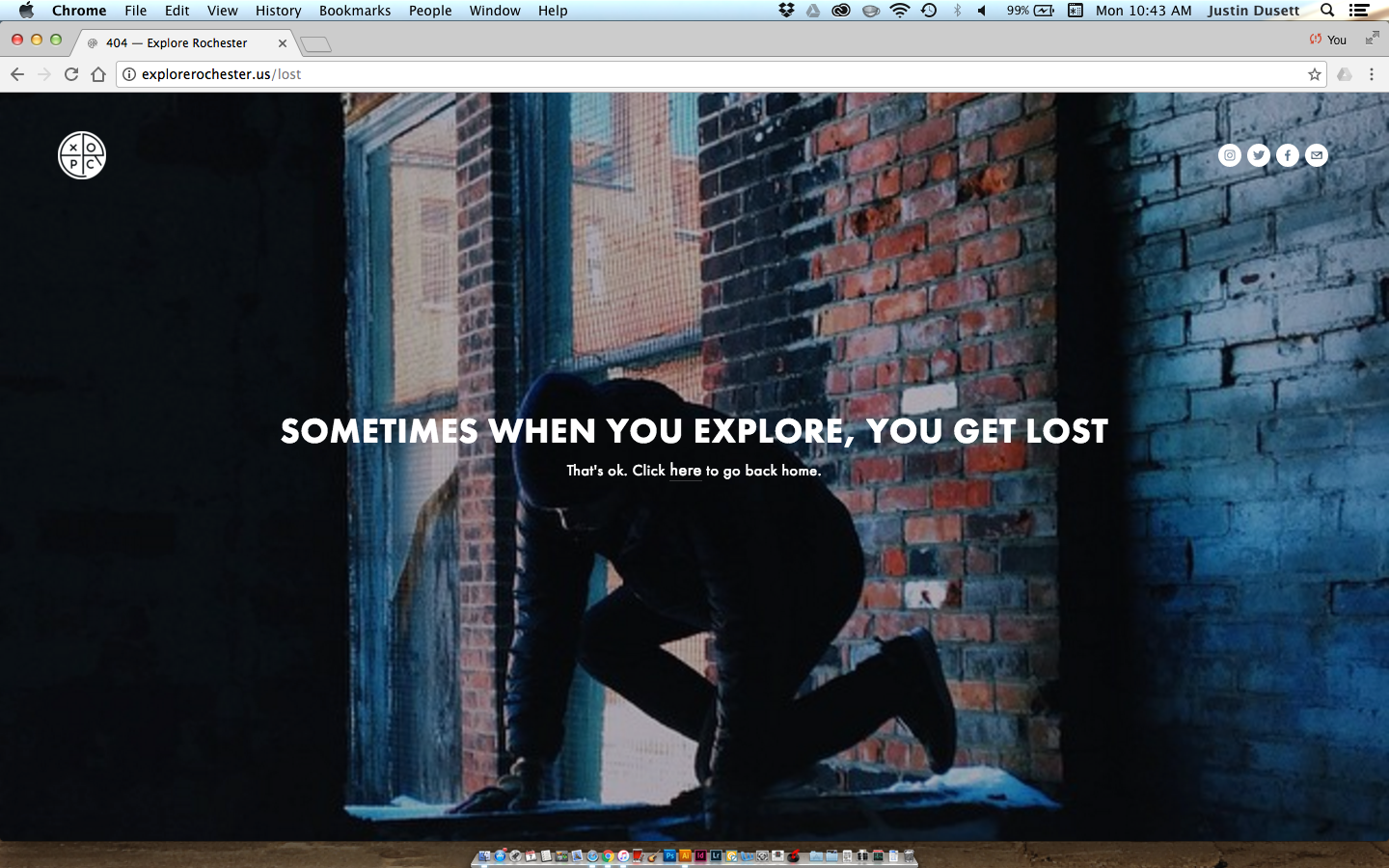
404 Error page designed for website
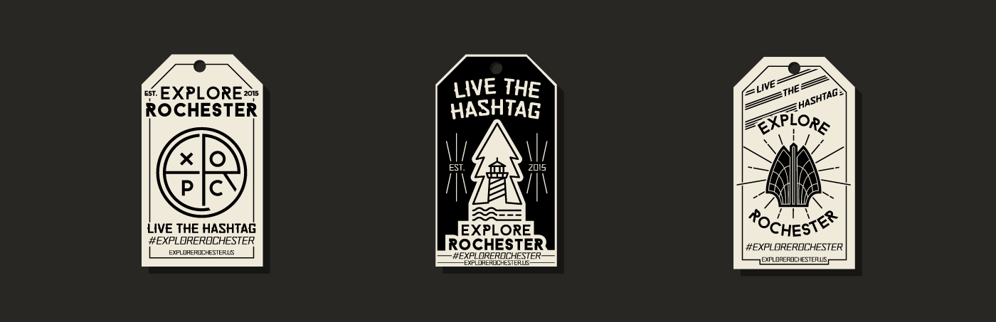
Hangtags designed for tshirts and other items
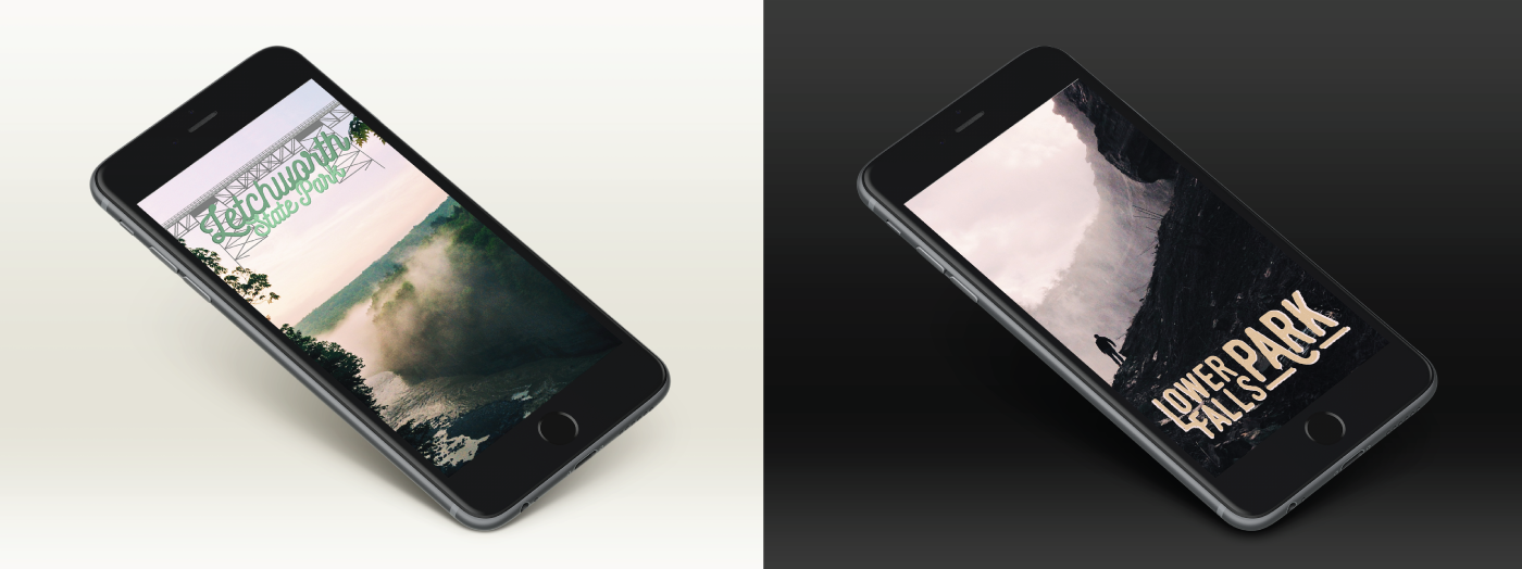
Snapchat Geofilters developed for popular locations within the Explore Rochester community. Letchworth State Park and Lower Falls Park
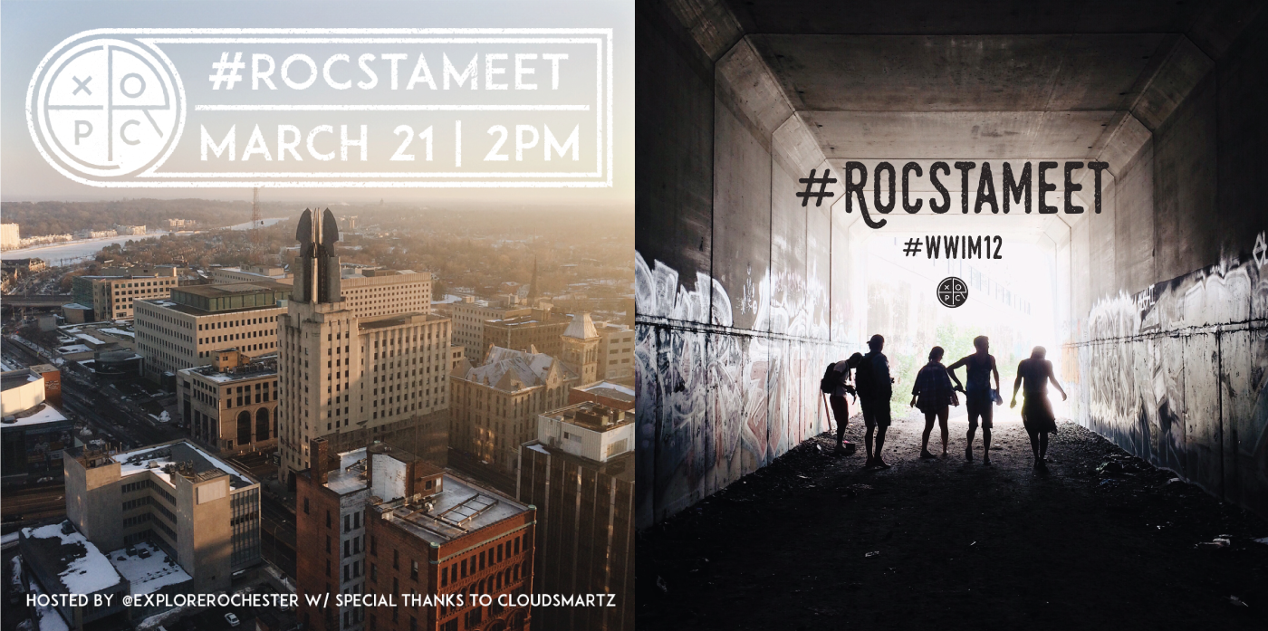
Advertisements created for #ROCstameet events