

jDusett Design
Personal Branding Project
In order to establish a visual identity for myself as a designer, I developed a logo mark and various other design assets. I found it very difficult to craft an image that represents my personal self in the truest light. Being able to put a logo to something that is constantly evolving was not easy.
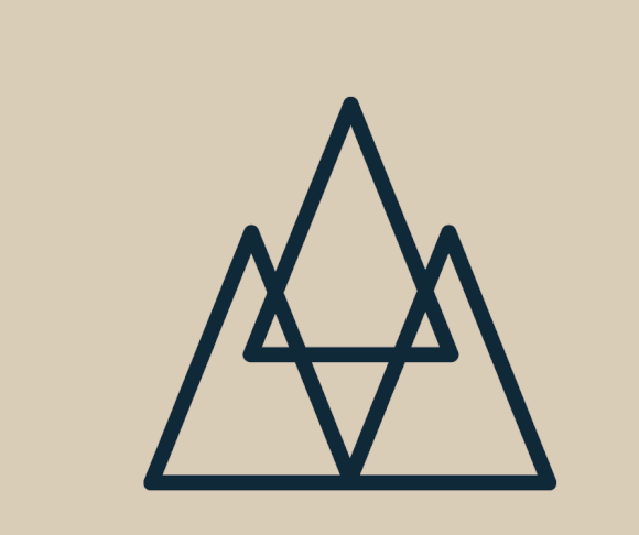
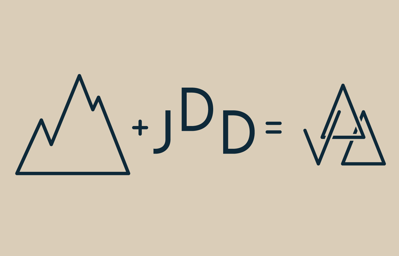
Logo Progression
I began the project by nailing out a few things that are important to me.
The brutality and constant commotion of the city, and the calming tranquility of nature.
I set out to combine the clean, sharp lines of a city skyline with the smooth flowing lines of a mountain-scape.
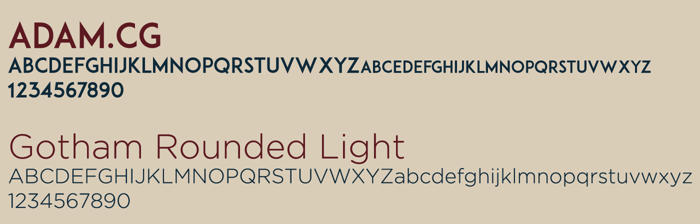
In order to maintain cleanliness in design, I elected to use 2 typefaces. Adam.CG Caps for headlines and Gotham Rounded Light for subtext. The harsh lines and boldness of Adam.CG tied in with the city structure while Gotham was clean but rounded and free flowing much like the mountains.
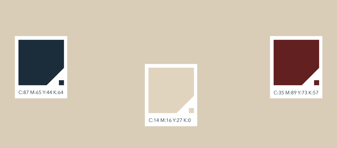
For colors, I chose deepened hues of red, white, and blue. I wanted a color pallet that displayed a sense of heritage and long-standing principles.
Using a simplified version of the logo, i created a pattern that would serve as the backdrop of various items including the website, business cards, and envelope.

Pattern developed for business cards and other stationary using a simplified version of logo.

Clockwise from top left; invoice, preliminary website landing page, logo, stickers for sealing packages, business cards, envelope.
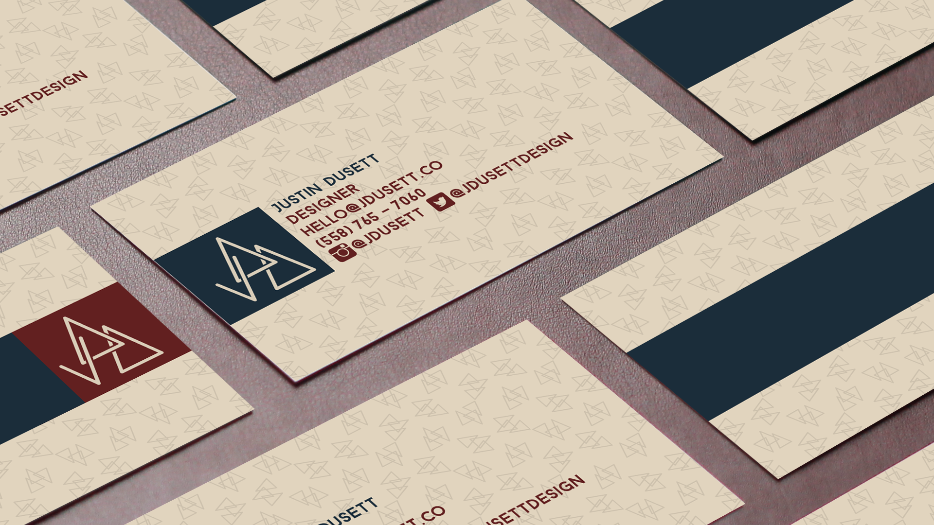
Business cards printed on 3-ply paper with a red stripe serving as the center piece of paper.