
________________________________________________________________________
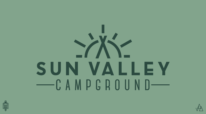
Sun Valley is a campground that I went to growing up. I wanted a graphic that was welcoming and an icon that could easily be embroidered on anything. The top icon serves as a sun and a tent, while the top of the tent creates a valley.

Focus is a photography studio. The goal was to have the viewer focused on the center to express the importance of a clear vision. What you c should be in focus.

Located in Lake Placid, New York, Mirror Lake is known to reach a level of serenity causing the water to be flat enough that the surrounding trees reflect beautifully off of the glass-like water. Half of the text is "mirrored" to represent this pristine setting.

New Line is an electrical company. Taking inspiration from a simple electrical schematic model, the typeface connects the N to the L to form a rectangular shape. In doing so; it uses a single "new line" to pen the companies fore-letters.
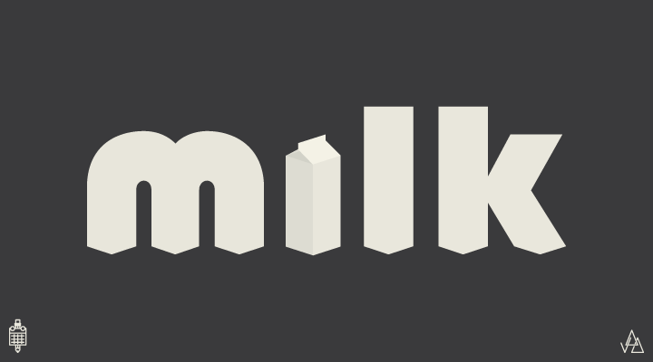
Everyday products need logos too! I took inspiration from a milk carton to create a simple, strong mark for "milk".
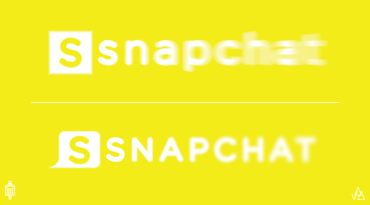
Snapchat has a ghost logo that represents what the company does, but they have no typographical presence. The logo slowly disappears towards the end, symbolizing the 10 second viewing time for a snapchat photo or video.
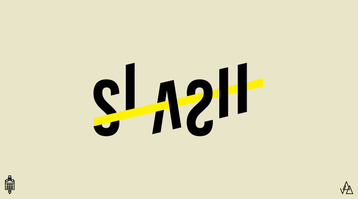
As a designer, it's hard to answer people when they ask "what do you do?" I wear a lot of hats, so the answer is usually something along the lines of "logos/layouts/icon design/professional nose-hair trimmer/original art/web design/etc.". Slash is a design studio.
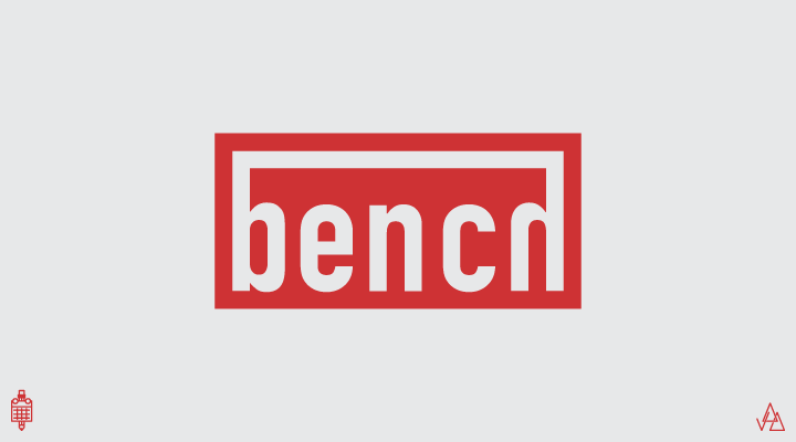
This is a logo for a bench. I wanted something that looked strong and industrial, while still visually portraying the object.

Kanye West thinks he's running for president. I wanted to convey Kanye's harsh and bold aesthetic, while incorporating some American imagery. The two E's in "YEEZY" combine to make a flag. The overall color palette was inspired by the tones in Kanye's recent collection of clothing. One nation, under (a) God.

If food tastes "meh" you just add sriracha and it's suddenly 5 stars. I wanted to create a logo for sriracha that didn't look like it was drawn quickly on paper and scanned into a vector program (like their correct logo). The "s" is meant to mimic the head of a rooster, their current icon. It can also serve as a standalone icon. The final "A" comes to a point to round out the logo and represent the spike of flavor sriracha can add.
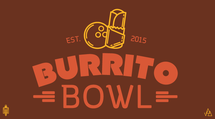
Remember the last time you went bowling (probably around 2004). What were you really craving to eat that night? I'll answer for you. Mexican food. Burrito Bowl is a Mexican restaurant and bowling alley. They really just order chipotle and deliver it to you while you're at your lane. Bowl 3 strikes, get free guac.
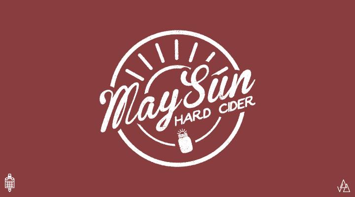
May Sun Hard Cider is the perfect hard cider to drink when you're sitting in a barn that you rented on air bnb to get out of the city for a weekend but you still brought your MacBook and a spare iPhone battery. Each 6 pack comes with 6 cans that are hard pressed to resemble a mason jar. Cool breeze, may sun.

"At Water" is an organization that helps bring wells to areas that see little-to-no purified water. Using the "AT" to create a spout and water, I created a type based logo as well as an icon that can be used to represent the organization.
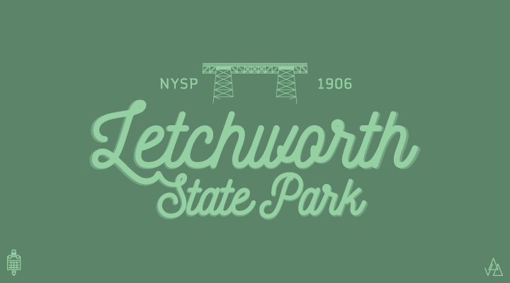
Letchworth State Park is a beautiful place. A great escape from the city. I wanted to create a smooth type logo for it. The bridge atop is the bridge in the park. It was gifted to the state of NY by William Pryor Letchworth in 1906.
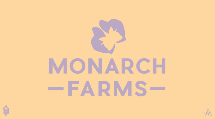
Monarch farms is an animal shelter. Much like the growth from caterpillar to butterfly, the animals see a rebirth as they are given a new home. The logo is composed of the silhouette of a dogs head with a cats head in the white space. It is on rotated and reflected to create a butterfly.
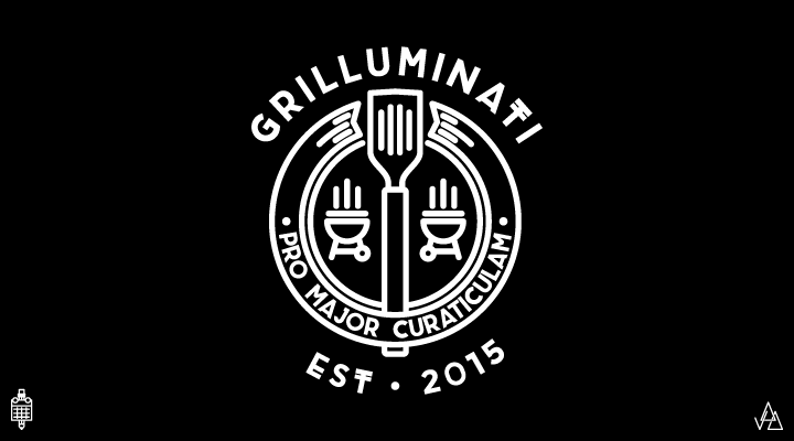
Grilluminati is a burger restaurant. Or is it? It's the secret society of burgers. I wanted an emblem that resembled something of the "secret society" sorts but made sure people knew what kind of restaurant it is. The bottom says "Pro Major Curaticulam" which, in Latin, translates to "For The Greater Grill".

"I Scream" is an ice cream parlor probably somewhere in St. Marks Place in NYC. Fully stocked with ice cream cold enough to withstand face-melting guitar solos. Soft Serve for a hard rock soul.

Notel is a motel that understands that if you're staying at a motel; you probably don't want people to know that you're staying at a motel. So, they take extra precautions to be sure that there ain't no tellin'. I used the ligature from the "t" to create a "shhh" face in the "o".
Taking inspiration from the legendary front grill of their trucks, I decided to create a secondary logo for Jeep.
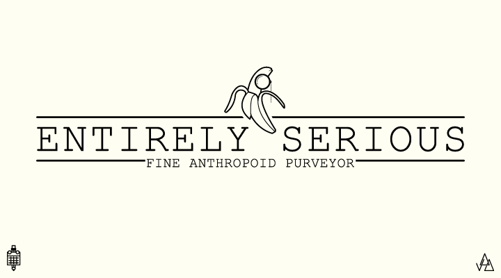
Entirely Serious is a fine anthropoid purveyor. That means "Entirely Serious" is a monkey business. I wanted to play on the term "money business" by turning it into a serious company. The typeface is playful in spirit but mature at first glance. The logo mark is a partially peeled banana wearing a monocle.
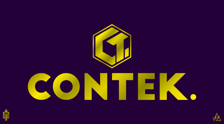
Contek is a company that makes sustainable housing out of old shipping containers. I wanted a strong typeface to show the strength of the housing. The C and T in the logo mark lock together to form a hex-bolt that is commonly used in the construction of these homes. The white space between the C and T create a rectangular cube; the shape of a container.
This project contains a small portion of the full project. For all 30 logos, please visit my instagram